Sesame dispose d'une API Java permettant de manipuler du RDF…
Dashboards from SPARQL knowledge graphs using Looker Studio (Google Data Studio)
You want to demonstrate the content of your knowledge graph accessible in SPARQL ? You can easily use dashboard tools, such as Looker studio (formerly Google Data Studio) which require no development and is free to use. Of course, Sparnatural is another possible solution !
This guide will describe every step you need to know in order to create a Looker Studio Dashboard from SPARQL queries. All along, an example will be shown to illustrate all the steps with screenshots, code text and quotes.
Step 1 : Getting the SPARQL Connector
Looker Studio does not provide any native connector for SPARQL. But a community connector exists, called SPARQL Connector, made by Datafabrics LLC, that can be used to create the data source. You can find it by searching for community connectors, or use this link. The code is available in this Github repository.
You have to grant access to your Google account for SPARQL Connector before using it. You will be able to find it in the connectors panel, in the Partner Connectors section, for your next queries.
Step 2 : Connect your knowledge graph
From your report, click on “Add Data” on the bottom right of the screen to open the connector panel. Select the SPARQL Connector in the connector panel (you can also search for it by entering “sparql” in the research field).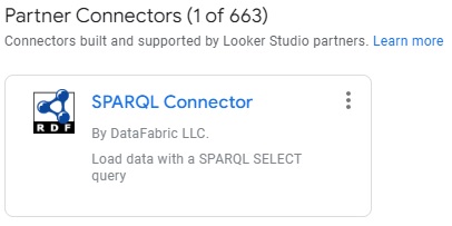
Then, follow the steps to create your own data source:
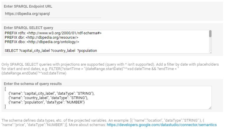
- Enter the URL of the SPARQL endpoint (the endpoint must be publicly accessible, without authentication), for example, with DBPedia:
https://dbpedia.org/sparql- Then enter the SPARQL query, for example the following selects countries, their capital city label and their total population:
PREFIX rdfs: <http://www.w3.org/2000/01/rdf-schema#>
PREFIX dbr: <http://dbpedia.org/resource/>
PREFIX dbo: <http://dbpedia.org/ontology/>
SELECT ?capital_city_label ?country_label  ?population
WHERE {
?capital_city  dbo:type dbr:Capital_city.
?capital_city rdfs:label ?capital_city_label.
?capital_city dbo:country ?country.
?country rdfs:label ?country_label.
OPTIONAL {?capital_city dbo:populationMetro ?population.}
FILTER (lang(?capital_city_label) = 'en')
FILTER (lang(?country_label) = 'en')
}- For each field on your query, you have to create one field on your data source and select its type. To do so, you have to build a schema like this one:
[{"name": "capital_city_label", "dataType": "STRING"},
    {"name": "country_label", "dataType": "STRING"},
    {"name": "population", "dataType": "NUMBER"}]
Be sure your “name” fields match the fields you have on your query in the same order. You have to select the “dataType” you want for each of your fields, but you can change it later within Google Data Studio. Click here to learn more about data types.
Once every field is completed, you have to click twice on “Add”. If everything goes well, the connector panel will disappear and your new data source will appear on the right of the window and is ready to use. It is defaultly named as “SPARQL Connector”.
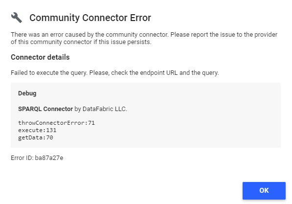
If you made a mistake while creating your data source, the SPARQL Connector panel can :
- Show an error message, that will indicate you the error type (endpoint, for example)
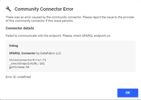
- Do nothing and you will have to check on your schema to be sure everything is correct.
- Create a data source as it should do, but Google Data Studio can’t use your data source, and show you this message on your chart :
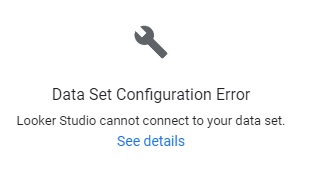
If you click on “See details” Google Data Studio will show you the error type from the connector :
Step 3 : Transform your data
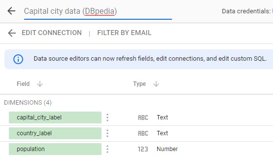
First, you can change the name of your data source by clicking on the icon on the left of the data source on Google Data Studio (the icon will change into a pencil) to open the data source edition panel.
Then, click on the top left of the new panel where the name of your data source is to modify it.
Change name of the example data source to “Capital city Data (DBpedia)”
You can also change your data source by modifying your parameters in SPARQL Connector. To do so, click on “EDIT CONNECTION”. The SPARQL Connector panel will open with your current parameters and you can modify them.
In the data source edition panel, you can also change the type of your fields so it fits your needs (numbers can be changed as currency, text can be changed as geographic data, etc.).
Be careful of your fields format, you may not be able to use your data anymore. For example, if you have a “,” as a decimal separator, you can change your data type but you won’t be able to use this field as Google Data Studio uses “.” as a decimal separator.
The connector will also apply default values in query results which don’t have a value for a requested field. The default values are 0 for numbers, “” for strings and false for booleans.
The population field on DBpedia has some null values, but the connector transformed all these values into default values (0 for numbers).
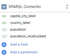
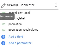
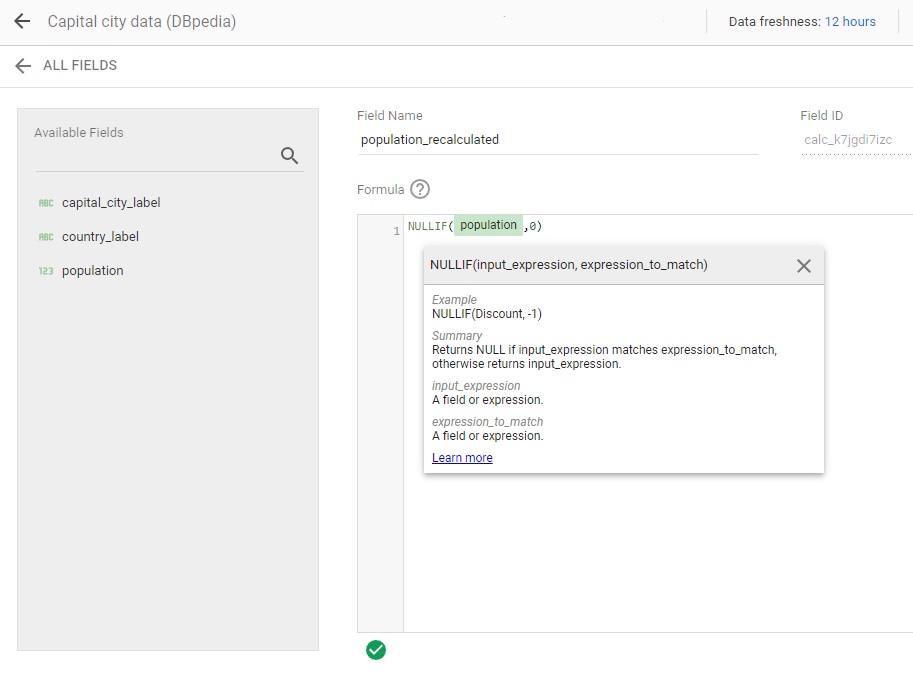
You may need to use calculated fields in order to obtain new fields or to transform data. To create one, click on “ADD A FIELD” on the right side of the same panel. Check the following page from the documentation to learn more about calculated fields.
By using a calculated field, the population data can be switched back to the original values.
![]()
In the new panel, choose the name of your new field, enter the formula. To ensure your formula is correct, a green check appears at the bottom of the panel. If not, it will turn into a red cross.
Enter the new field name: « population_recalculated ». Then enter the formula of the field : « NULLIF(population,0) ». In this case, if any population value is equal to 0 in the population field, it will turn into a null value in the calculated field.
Step 4 : Improve performance with data extraction
Once you manage to create all your calculated fields, you may have some useless fields in your data source. Those fields may decrease the speed of your dashboard. You can use the “Extract Data” to keep the fields you need in another data source that you will use to make your report.
To use it, click on “Add Data” on the bottom right of the screen and select “Extract Data”.

Then, select your data source and the fields you want to keep in your report. You can make many extractions from one data source if you need.
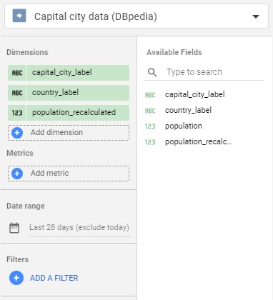
Choose the data source and keep only 3 fields : “capital_city_label”, “country_label” and “population_recalculated”.
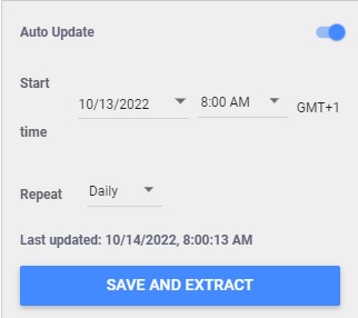
You can also configure the auto-update tool to make sure your extracted data are up to date with the latest version of your data source from SPARQL Connector. In the bottom right of the panel, switch the auto-update button then choose the occurrence of the update (between daily, weekly and monthly).
A data source defaultly named “Extract Data” appears with the fields you selected from the previous data source.

This method only works for data sources, you won’t be able to use it on blended data. Make sure to do the extraction before blending to improve your performance. To learn more about blending, see this page from the Looker Studio documentation.
Step 5 : Create your dashboard
Here is a quick guide on how to create a chart in Google Data Studio. Check the chart reference documentation for more information about charts available by default.
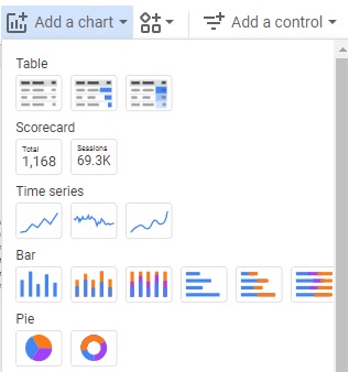
To build a dashboard, you will need to select a widget first (pie chart, table, histograms, etc.). Click on “Add a chart” on the top of the screen and select the one you need.
![]()
Click on “Add a chart” and select a pie chart.
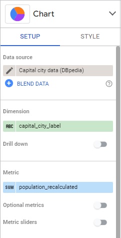
Select your chart on the report, it will open a panel on the right side of the screen where you can see the chart type and modify it. You can select the data to display in the “SETUP” panel. You can also customize the chart with the “STYLE” panel.
Place the chart on your dashboard anywhere you want to see it. Google Data Studio will automatically choose the data source and some fields which fit the charts, but you can choose to modify them in the “SETUP” panel on the right.
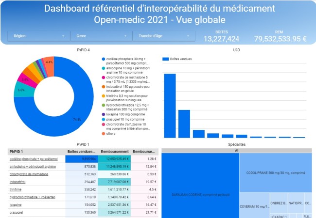
Choose “capital_city_label” as dimension and “population recalculated” as metric.
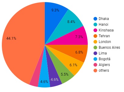
Here is the result of this configuration :
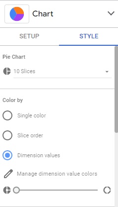
In the “STYLE” panel, you can choose to modify some options in the chart to customize it.
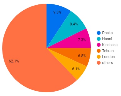
Change the number of slices from 10 to 6 to see the 5 top values + others value.
The chart will change automatically with your new parameters as you change them.
Congratulations, you have successfully made your first chart!Try to get your own data sources with SPARQL Connector, make your own dashboards with Looker Studio, and send us the links !
Next Post: Clean JSON(-LD) from RDF using Framing
Previous Post: Sparnatural à SemWeb.pro 2022 le 8 novembre